Fixed Income Investing Project
-
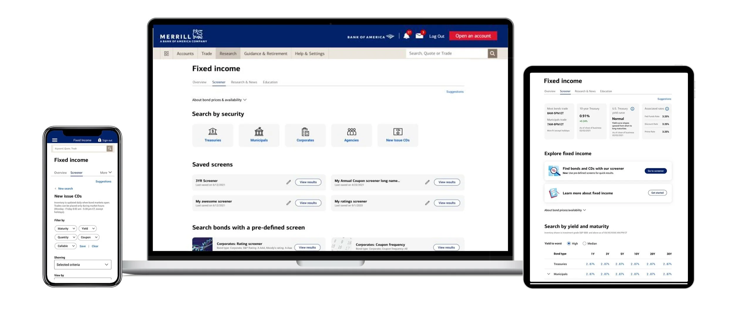
Our team updated the Fixed Income experience to be ADA 2.1 compliant and responsive. We enhanced the Product Center, Screener, News & Research and Education pages, added Pre-defined screens and added new filtering parameters. Major goals for this project were to increase customer satisfaction, prevent drop off at filtering before arrival at screener, increase user initiated trades and decrease call volume to the advisory center.
-
The Fixed Income marketplace has a diverse group of participants. Those looking to make long term gains, steady income or those looking for low risk investments are some of the participants in the market. We designed for all levels of experience in investing from novice to advanced. All age groups participate in the market but the majority of users are from an older demographic. Research suggests most users research and trade on web and very little on mobile.
-
Our XD team consisted of a Product Owner, Project Lead, Sr. Designer and Content Strategist. We partnered with a team of 7 stakeholders. Additional partnerships included ADA Analysts, Research Analysts and Engineers. My role on the team was to lead design and strategize a pleasant user flow that will result in more trades and less call volume.
-
This project took about a year to complete from end to end. Initial stakeholder and requirement meetings took place in February 2021 and development began in early 2022.
Design Challenges:
We were challenged with whether or not to start the experience with an overview page or go straight to the screener page, these are the two main and most robust pages in the experience. Other interesting challenges were how a user selects which security to search by, how to better showcase a users saved screens, adding a predefined screens feature and how to improve the filtering experience. Lastly how to showcase the data saturated table especially on mobile in a digestible way while also keeping it as accessible as possible.
Ultimately we decided to keep the Overview page as the start of the flow - but took a serious look at the structure of the page. Power users may be more apt to go straight to the screener page - but what strongly influenced our decision were those users that needed more structure, clear direction on what options are available to them and even more insights and research into Fixed Income as an investment strategy.

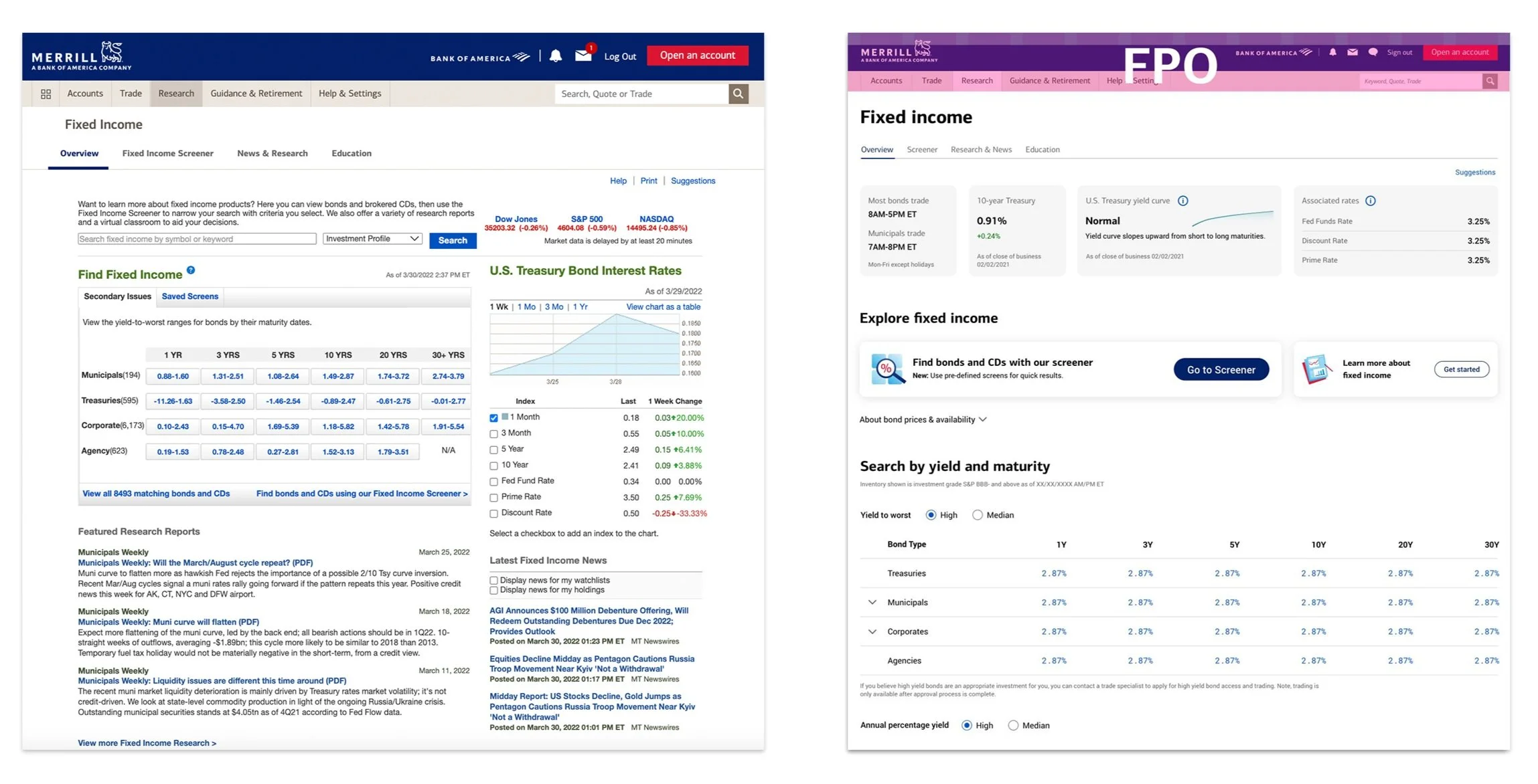
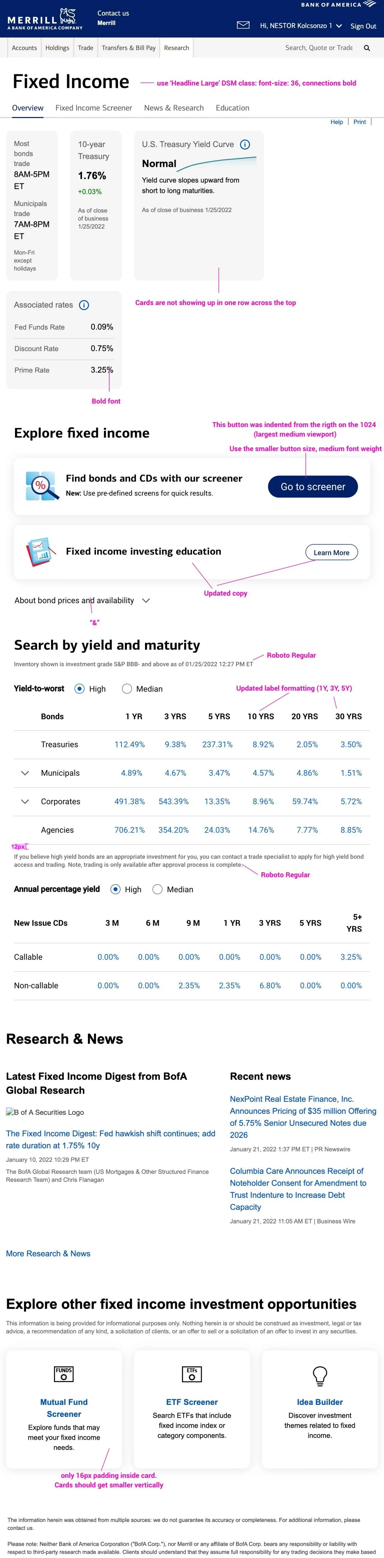
Overview page “before”

Overview page “after”

My design process
Phase 1: Is to gain an understanding of who uses these pages, how people research and trade fixed income, what are the pain points? What are the requirements for this project? What are the nice to haves but can be sacrificed for MVP if need be. Will we be doing any testing?
Action: At this phase I am engaging regularly with our business partners and stake holders. We are having multiple work sessions a week and really collaborating freely together. I am leaning on them for their industry expertise and gathering notes. We go through the existing flow together and I am starting the initial rough architecture of the page while defining the project requirements. Simultaneously we are meeting separately as an XD team to determine what we have available in Helix (DSM) and what we would need to bring to our systems team as funded enhancements to our DSM. I am beginning initial rough designs and bringing to work sessions for feedback.
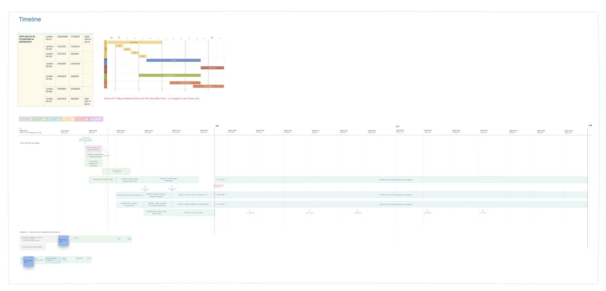

Throughout the design process I am regularly bringing designs to XD “Crit and Shares” to gain feedback from my peers, promote awareness on the project and ensure consistency across any simultaneous projects being designed/developed. This is also a great opportunity to as a team identify interactions and potential global elements to be added to our design system.
Big wins
The prior design forced a user to select attributes and then hit search in order to view any results. The newly designed screener page will display results right away and a user can filter down based on preferences. This creates a much easier, less cumbersome and enjoyable interaction because it doesn’t require the user to make so many decisions before accessing any data, it also provides all available information up front without a user having to travel through the experience, potentially missing valuable insights.


Another win - promoting a users saved screens and adding a new feature, predefined screens.
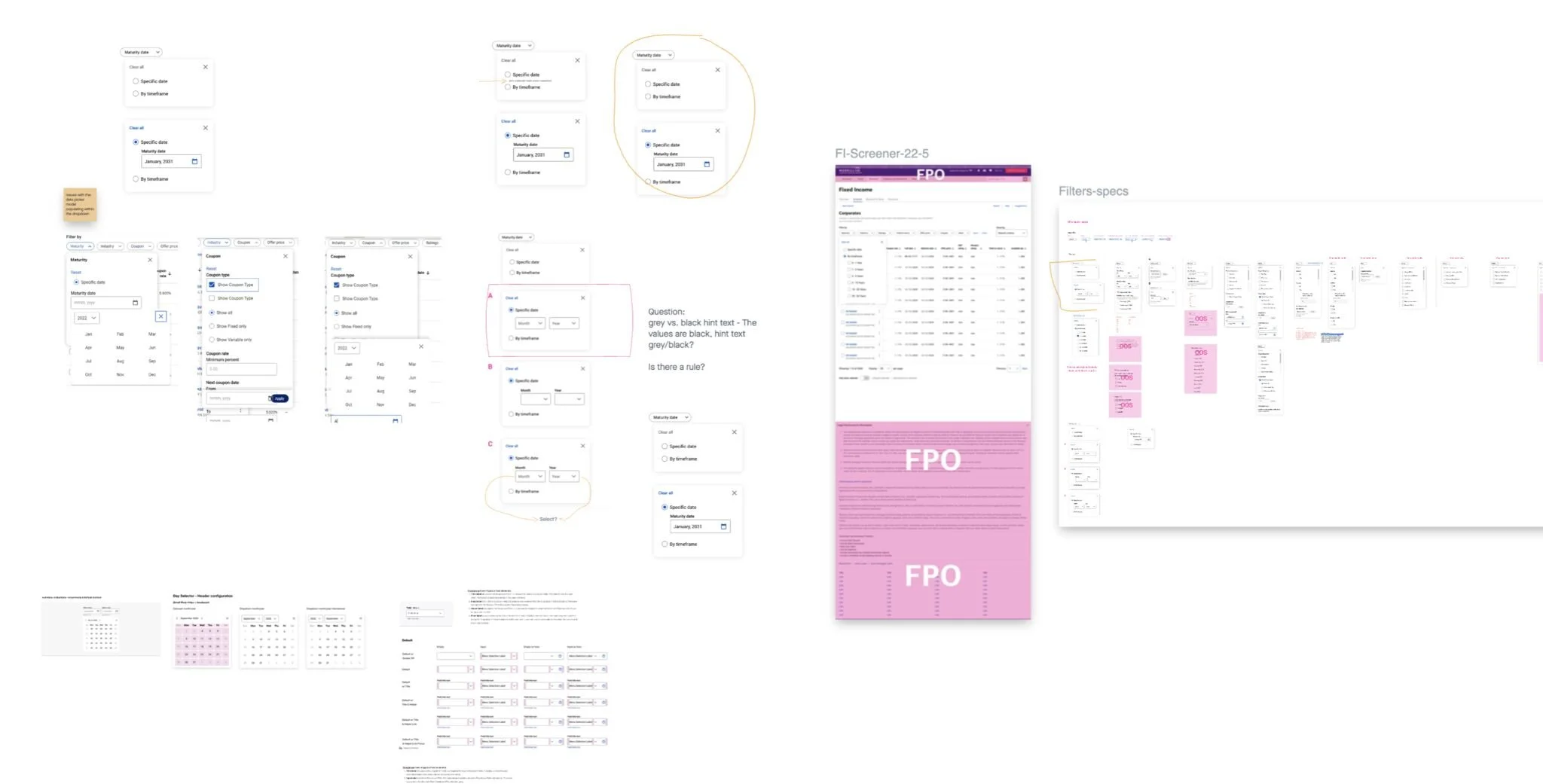
Filter Chips
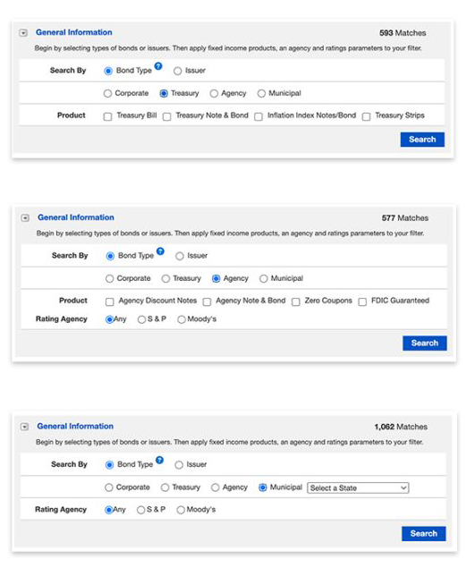
One of the main challenges in this project was to redesign the filtering capability and attributes associated with researching and trading. We started by wire framing the requirements for each filter. I spent quite a bit of time researching how competitors approached filtering. Eventually I stumbled upon Google Flights - Inspired by Google’s Material Design we adopted filter chips and were able to design chips for our unique interactions. Because this was a new component built and designed as part of a funded project we were able to work with the systems team to add filter chips to the DSM and multiple projects are able to now adopt this design solution for advanced filtering.


Together with business partners and content strategists we applied unique attributes to each filter

Testing
After the design phase we move into testing if the timeline and scope allows. The objective of the this user test was to validate whether the filter interaction pattern is a valid pattern that can be used across the enterprise - and also to improve the client experience by making it easier to find and trade bonds, build and manage fixed income portfolios and implement a full asset allocation strategy.
-
We had 20 participants on Desktop only. Study was remote, unmoderated, task based and users were instructed to “think out loud”.
-
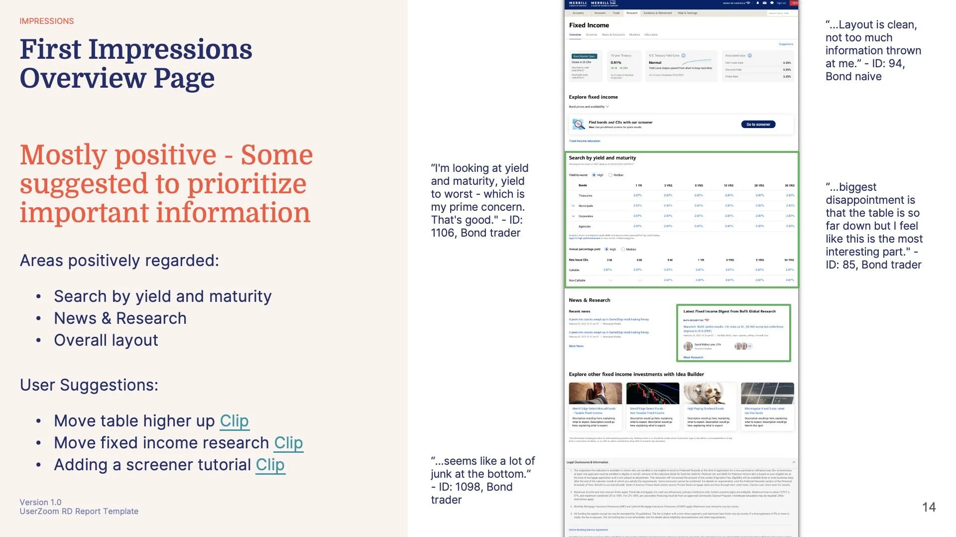
Overall the feedback was mostly positive with some suggestion for prioritization. Some areas that were positively regarded were search by yield and maturity, news & research and overall layout. Some suggestions included updated to the filters, moving the table higher up and adding a screener tutorial.
-
We made a number of adjustments to the screener and overview page designs based on user feedback and data. Some of them included adding an apply button to the filter drop downs, adding descriptions to the predefined screens, and making changes/additions to filtering attributes.

Development

I will typically meet with the engineering teams and walk through the designs when handing off the files. I will join grooming sessions and regularly attend development reviews during sprints. I will provide regular feedback as the designs are being implemented on the development site. If there are a number of front end/design changes that are needed I will provide mockups and upload to Invision if helpful.
Overall we were very successful in reaching our goals for this project.
Simplified UI: When we conducted our initial research studies before starting on design we received user feedback that expressed an appetite for more information or even tutorials on this type of investing. Higher net worth individuals usually work with advisors or will move right to the screener, but those who are just starting to explore Fixed Income / more novice investors can benefit from some basic knowledge and pointers - which prompted us to include the cards at the top of the overview page with valuable but not overly saturated information and the ability to use a tooltip to get more insights.
Adoption of filter chips: We were able to design and adopt an advanced filtering pattern and get the pattern added to our design system.
New features: Predefined screens are those data tables that are most often searched for. We found that investors beginning to explore this space highly valued this feature